Presence Card & Gift Shop was created around a familiar problem: a good piece of news deserves more than a rushed generic gesture, yet choosing a card can become harder when the cover has already said too much. The catalogue starts with blank-interior A6 cards so the sender remains the author. We keep the visual language quiet, using original colour, paper-like forms, and short printed greetings rather than borrowed brand signals. That approach makes a card suitable for a colleague, friend, neighbour, or family member without prescribing the relationship.
The range exists because cards and mugs solve different parts of the same gifting task. A card marks the moment immediately and holds the detail that only the sender knows. A mug can remain useful after the celebration, whether it sits on a desk, fills a kitchen cupboard, or becomes part of a familiar tea break. We therefore describe card stock, fold, writing area, mug material, handle shape, and capacity plainly, helping customers compare physical choices before they decide on colour or a pairing.
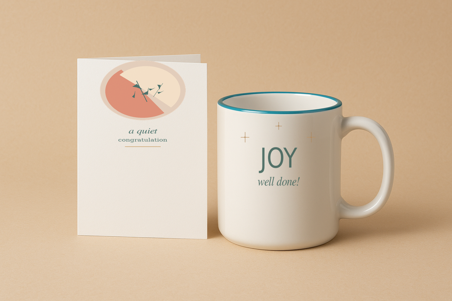
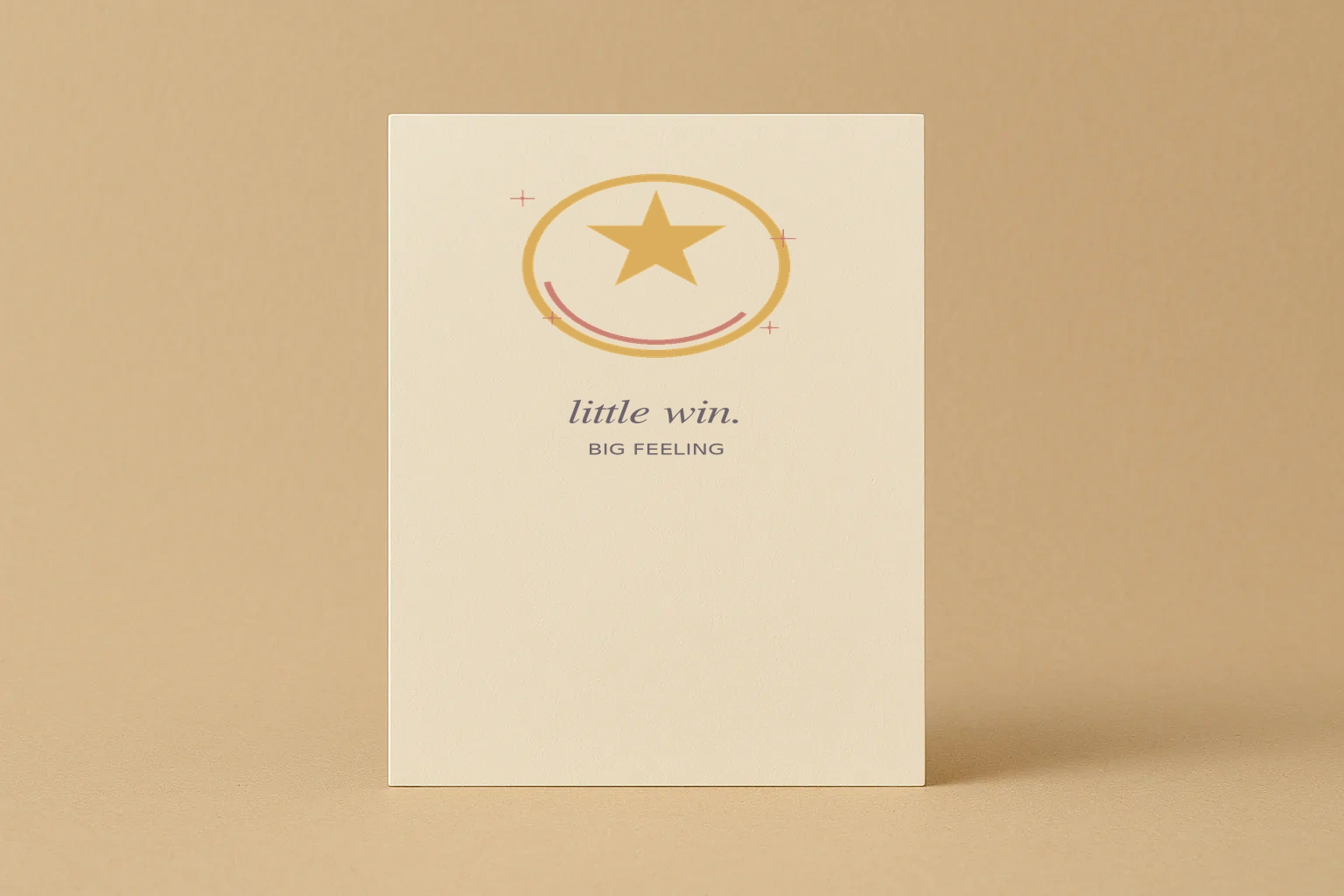
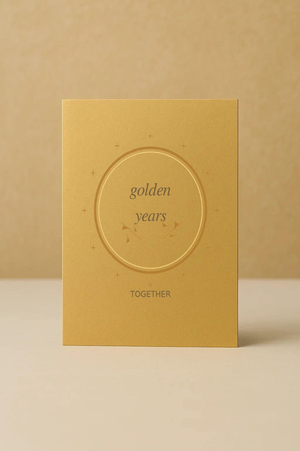
Selection is deliberately narrow. We organise five card designs and five mug or set options around occasion, writing space, capacity, and use rather than popularity claims. Each listing explains the object, its format, a sensible use sequence, and simple care. Product imagery shows the illustrated card fronts and printed mugs in clean studio photography without fictional packaging or recognisable third-party marks.
Our practical value is in leaving room for the customer’s own judgement. Someone ordering for a new home may prefer a generous tea mug and a textured card; someone recognising a small work win may choose a compact card or lower-capacity coffee mug. The shop will continue to develop this focused approach: clear category facts, restrained presentation, and support for customers who want a present to feel specific because of the message and the recipient, not because of a prewritten claim.